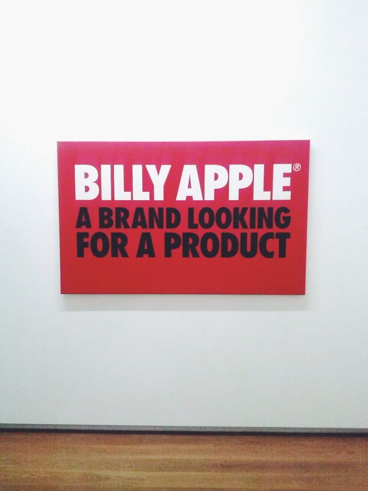
Apologies for the delay in sharing our review of the Billy Apple exhibition at the Auckland Art Gallery. It was a pure celebration of colour, typography, consumerism, popular culture and most importantly, ideas about the way we consume, our relationship with money and our perceptions about all of the above.
There are many instantly recognisable elements in his work, the Apple logo, the invoice references as well as some from marketing, branding and consumer packaging, that will easily make the art viewing novice question the lines between traditional high brow and that of modern, contemporary art.
The more experienced gallery goer will enjoy the recognisable elements, as the closer the works resemble their original references, the more interesting they become. What are you really looking at? Is there more, less to the work or it’s exactly as you see it?


Leave a comment