
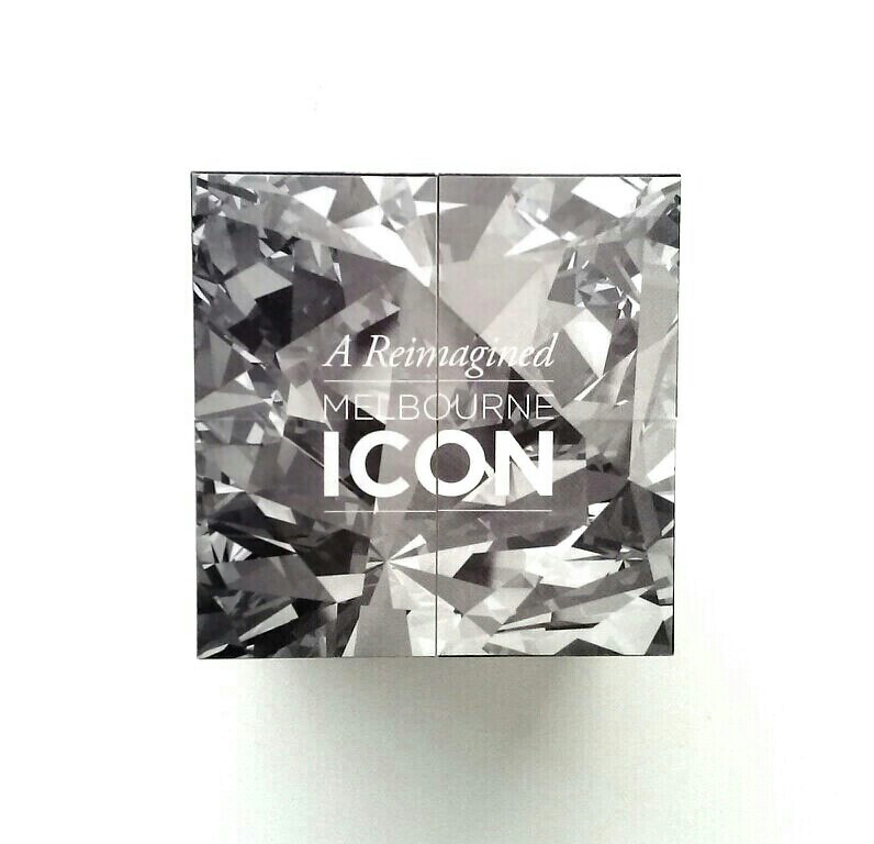
On the opening day of Melbourne’s latest retail shopping sensation Emporium in the CBD, eager shoppers were welcomed with this stylish desk accessory as a keepsake/memento. We are quite partial to using these cube puzzles as a leave behind/promotional merchandise because we’ve done something similar before in a past project. So it’s safe to say we are somewhat qualified to provide some feedback on the marketing effectiveness of the Emporium cube.
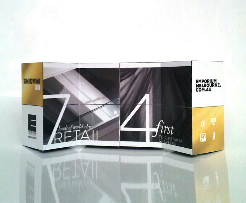
As stylish as it is, when you play around with it, you realise it doesn’t have as much dimension or practical use. The text inside are generic marketing copy. It doesn’t provide the store directory, it doesn’t say the opening hours, there really isn’t any practical information that warrants people keeping it. And we know in this age of material excess, even something of value will get tossed out if it’s lacking relevance eg. Yellow Pages books.
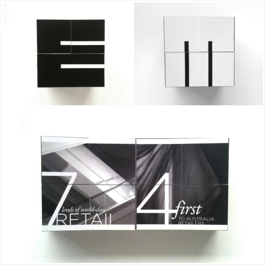
No denying that it’s clever with its play on the “E” for Emporium and “M” for Melbourne letters and sleek monochromatic colour scheme, but it could have had a stronger emotional connection beyond the smart graphic design elements. What if the inside of the cube showed the before pictures of Emporium? What it looked like 10 years ago before the refurbishment, like a pictorial trip down memory lane to show how far Emporium has come? A cube we found in Singapore did exactly that, showing old black and white pictures of colonial Singapore in the 1800s.
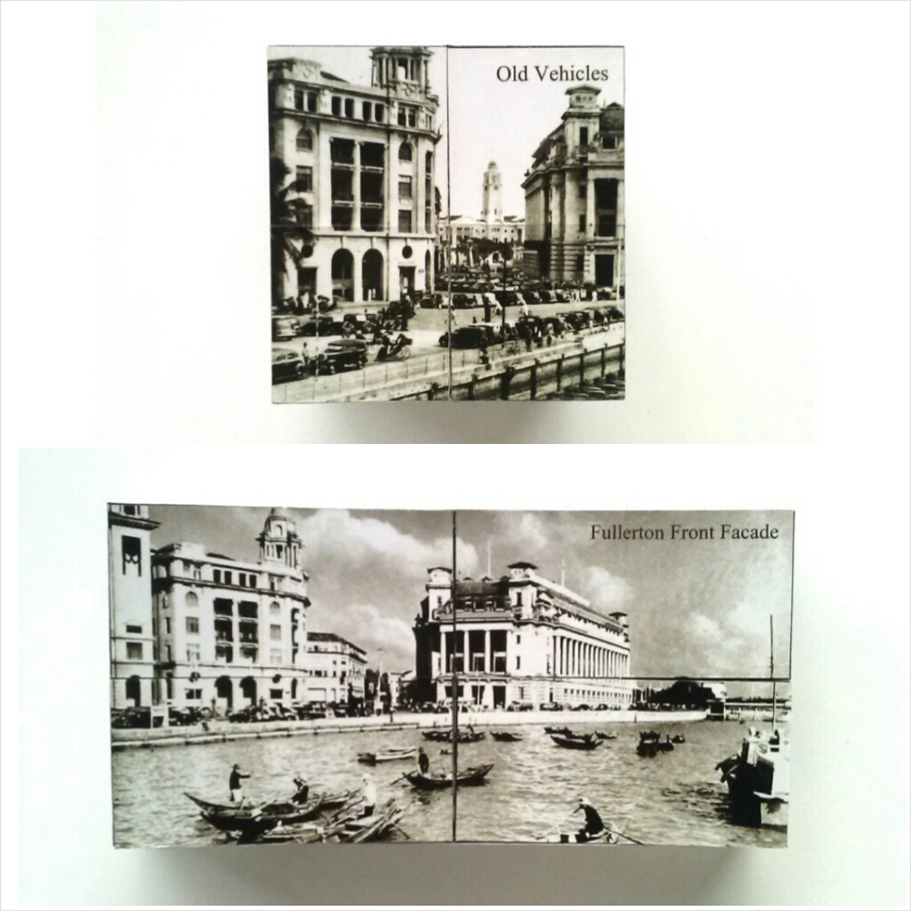
Everyone knows Singapore looks nothing like these old pictures, which enhances the value of the cube as there’s a historical/nostalgic element creating an emotional response to the cube, which is what’s lacking in the Emporium’s cube. A year from its opening, what will the cube express about the mall? Would it have any retaining value?
The challenge of promotional merchandise today is to justify some meaning for its use and existence. Having been to so many trade shows, events with loads of free promotional merchandise, there’s so much physical waste when people tire of them and chuck them out but also a waste in the lost opportunities to make a meaningful connection to the target audience through these freebies.
Don’t get us wrong, we do like the end result of Emporium’s cube, it’s so close to perfection in its conception to execution and it does look very stylish on our bookshelf, but it’s just short of taking a spot in our marketing trophy cabinet.

After checking out a few of the blog posts on your web
site, I really like your technique of writing a blog.
I added it to my bookmark site list and will be checking back in the near future.
Please visit my web site as well and tell me your opinion.
LikeLike
Good day very nice website!! Guy .. Beautiful ..
Wonderful .. I’ll bookmark your web site and take the feeds additionally?
I am glad to seek out so many useful information right here within the publish,
we need develop extra strategies on this regard, thanks for sharing.
. . . . .
LikeLike